
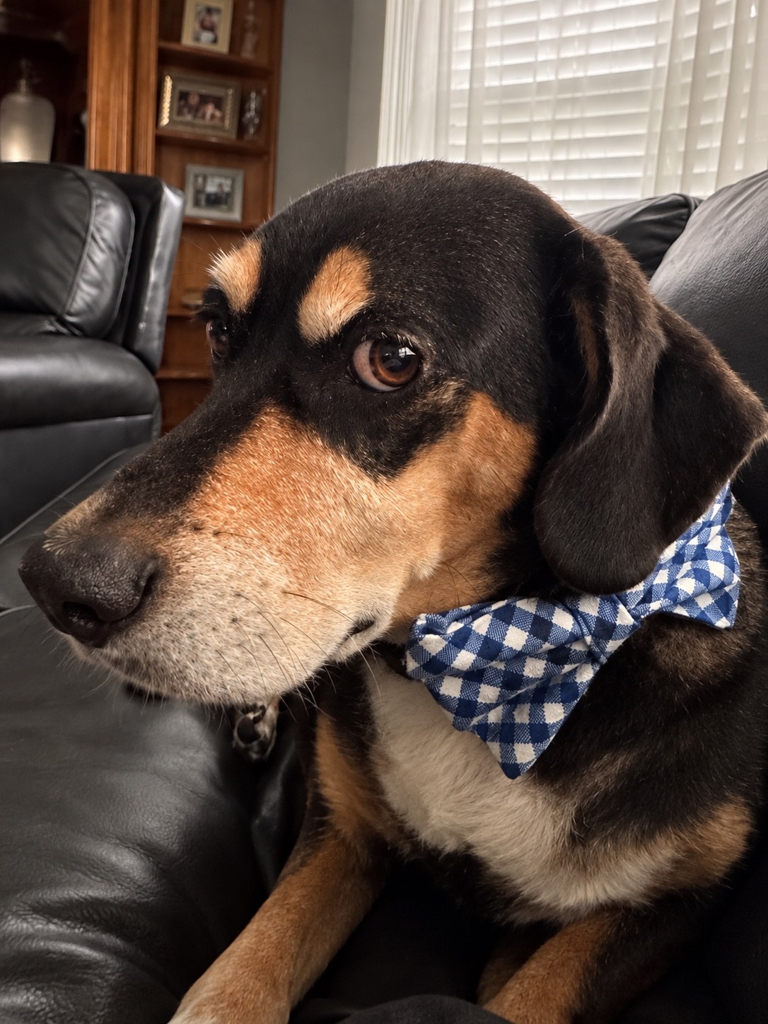
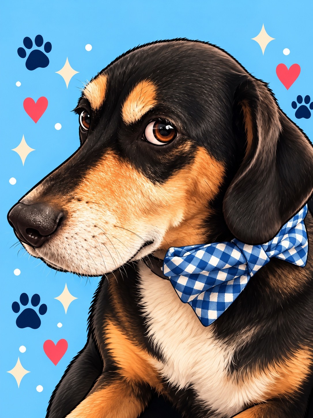
A pet wallpaper feels personal when you can recognize the animal behind the illustration. With Bernie, our Beagle–Basset Hound mix, several details make that connection: tan eyebrow patches, brown eyes, a pale muzzle, floppy ears, and a blue-and-white checked bow tie.
Comparing his photograph with the AI-assisted artwork shows both the resemblance and the changes that come with a more playful illustrated style.
A closer look at Bernie
In Bernie’s close-up photograph, his face turns slightly to one side. The angle reveals his muzzle shape, the tan markings around his eye, and the way his ear falls beside his cheek. His checked bow tie provides another recognizable detail.
The illustrated portrait carries these features into a brighter setting. His eyes look larger, the fur appears more defined, and the muzzle has warmer coloring. These are visible differences worth acknowledging: the artwork is a stylized interpretation, rather than an exact reproduction of the photograph.
What changes when the background changes?
The photograph includes a sofa, window blinds, and furniture. In the illustration, those surroundings give way to a blue background with hearts, paw prints, and sparkles.
This changes where the viewer looks. The room gives context to the photograph, while the illustrated background brings attention to Bernie’s face and bow tie. Dark blue paw prints and warm-colored hearts also stand out against the lighter blue. The result shows how a familiar pet can remain recognizable even when the surrounding scene becomes entirely different.
A portrait and a phone wallpaper use space differently
The close-up artwork fills most of the frame with Bernie’s face and chest. It makes small details easy to see, but leaves less empty space around him.
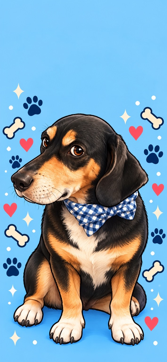
The tall wallpaper takes a different approach. It shows an illustrated seated pose, places Bernie lower in the composition, and leaves a broad area of blue above his head. That open area can give a lock-screen clock more breathing room, although the exact result depends on the device and its wallpaper settings.
The seated illustration also goes beyond what the close-up photograph shows. It should be understood as an interpreted pose, not a record of Bernie sitting exactly that way.
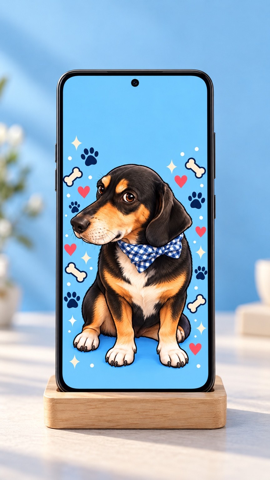
The phone mockup helps demonstrate the overall presentation. It is a visual preview, rather than proof of how the wallpaper will fit every phone.
Fluffy: from one reference to a playful pattern
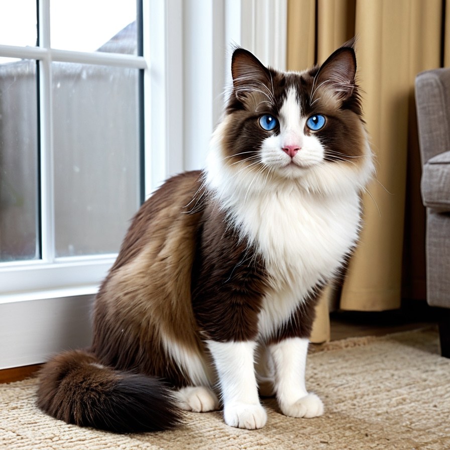
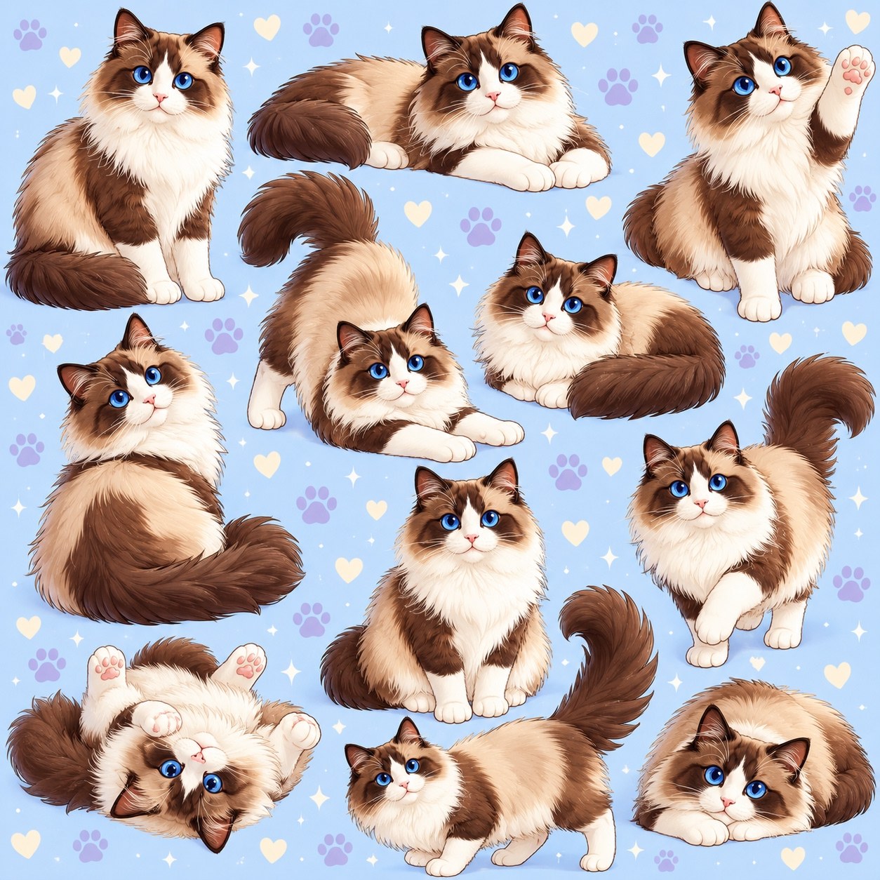
The Fluffy example explores another format. Instead of one large portrait, the artwork features multiple illustrated poses across a pale blue background.
Blue eyes, a white facial blaze, a fluffy white chest, and brown-and-cream fur connect the reference image to the pattern. Lavender paw prints, cream hearts, and small white sparkles fill the spaces between the cats.
The poses are creative variations. A single reference image does not document the cat waving, stretching, or rolling over; the illustration imagines those moments while repeating recognizable features.
What to look for in your own reference photo
Bernie’s examples offer a useful starting point when choosing a pet photograph. Look for an image where the eyes, muzzle, ears, and coat markings are easy to distinguish. If an accessory matters to you, make sure it is visible too.
Additional angles can help explain details that one photograph hides. A side view shows muzzle length, while a wider view provides more information about body proportions and markings.
The useful comparison is specific: which features still look like your pet, which have been stylized, and how does the composition work on the screen? Bernie’s bow tie and eyebrow patches—and Fluffy’s blue eyes and white blaze—give us concrete details to examine.